
Toolbar Settings Enhanced Guide with Examples & Screenshots
Toolbars in 2sxc are incredibly powerful, and Toolbar Settings let you fully control how they behave, where they appear, and how users interact with them.
What Toolbar Settings Do
Each toolbar placed inside the page can have custom settings to control visibility, hover behavior, floating behavior, and styling.
👉 If you are new to toolbars, start with the tutorial:
Toolbar Basics
⚙️ Available Settings (with explanations)
| Setting | Values | Description | Screenshot |
|---|---|---|---|
| autoAddMore | start | end |
Adds a “…” button if too many groups exist. Default: end. |
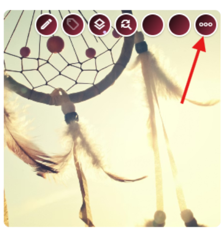 |
| hover | right (default) | left | none |
Where the toolbar appears when hovering over the element. | 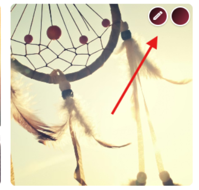 |
| follow | none (default) | initial | scroll | always |
Keeps the toolbar visible even when its element is scrolled out of view. It does not follow the mouse. | 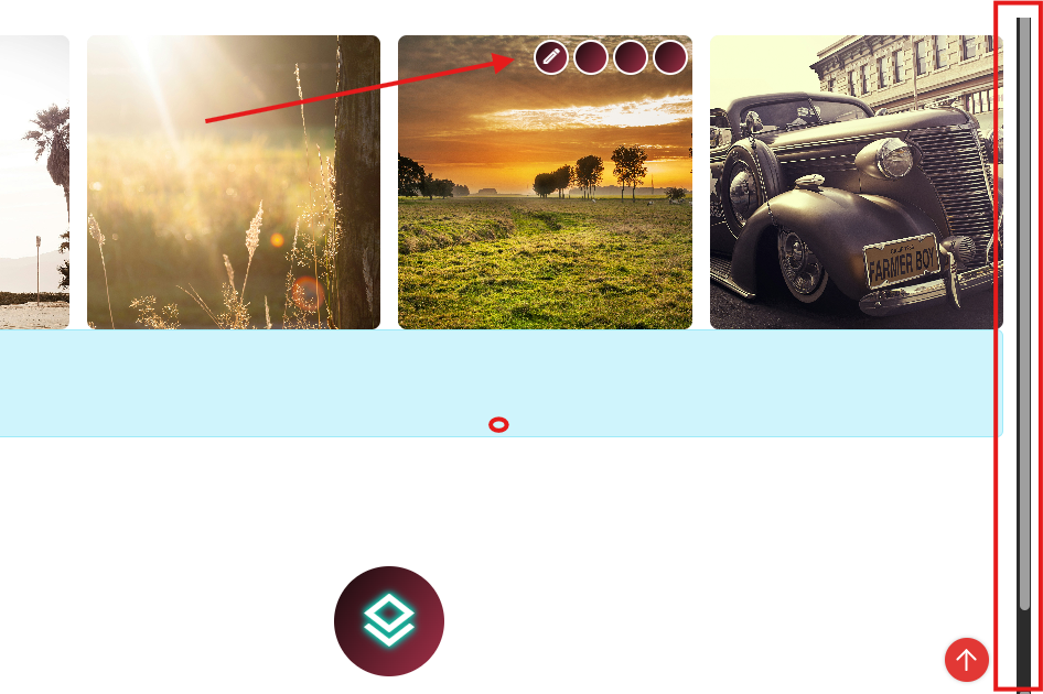 |
| show | hover (default) | always |
Whether the toolbar is always visible or only when hovering over the element. | 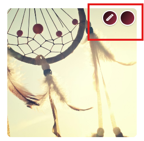 |
| classes | string | Additional CSS classes to style your toolbar | 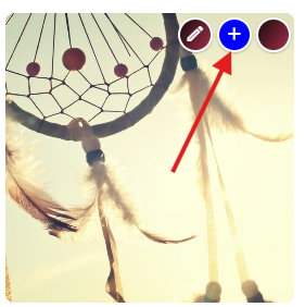 |
How to Use in Razor
This example uses the simple TagToolbar API.
<div @Edit.TagToolbar(Content, toolbar: new[]
{
  "settings&hover=left&autoAddMore=start"
})>
  Content inside this div
</div>
How to use settings parameters
<div id='tagWithToolbar1' @Edit.TagToolbar(
  toolbar: new [] { "toolbar=empty", "+new?contentType=UiEmptyHelloWorld" },
  settings: new { hover = "left", show = "always" } )>
  Float over this box to get a (+) button.
</div>
Example in JavaScript
<div id="my-table"></div>
<script>
  const tableEl = document.querySelector("#my-table");
  const sxc = $2sxc(tableEl);

  // Only render toolbars in edit mode
  if (!sxc.isEditMode()) return;

  // Define toolbar buttons
  const actions = [
    { action: "edit", entityId: 27, classes: "blue" },
    { action: "delete", entityId: 27 }
  ];

  // Toolbar settings (hover, follow, etc.)
  const settings = {
    hover: "left",
    follow: "scroll",
    autoAddMore: "end",
    show: "always"
  };

  // Build and render toolbar
  const toolbarHtml = sxc.manage.getToolbar({ items: actions, settings });

  const wrapper = document.createElement("div");
  wrapper.innerHTML = toolbarHtml;
  document.body.appendChild(wrapper);
</script>
Old Syntax (Deprecated)
<div class="sc-element">
  <ul class="sc-menu" data-toolbar=''
      settings='{ "hover": "left", "align": "left" }'></ul>
</div>
Do not use this anymore
More Resources
Toolbar Tutorials Tutorials for working with edit toolbars
Customize Edit Toolbar – Hover Alignment & More Legacy blog post for historical context
History
- Introduced in 2sxc 8.06
followadded in 11.06